
Color is not just a matter of sight; it evokes emotions, behaviors, and even physiological responses. The psychology of color is the science that helps us understand how different hues can evoke moods, making it essential in home design, branding, and daily life. At Alexia Home Designs, we know the importance of choosing the right color palette to create spaces that align with your emotions and lifestyle.
The Science Behind Color Psychology
Every time the light reaches our eyes, it fires a series of signals within the brain. Those signals affect mood and perception. It is one reason red may energize us while blue induces calmness. Colors also bear meanings culturally and personally, furthering their effects on emotion. Thus, you will be better positioned to choose and design spaces that match your needs and activities.
The Psychology of Specific Colors
Red
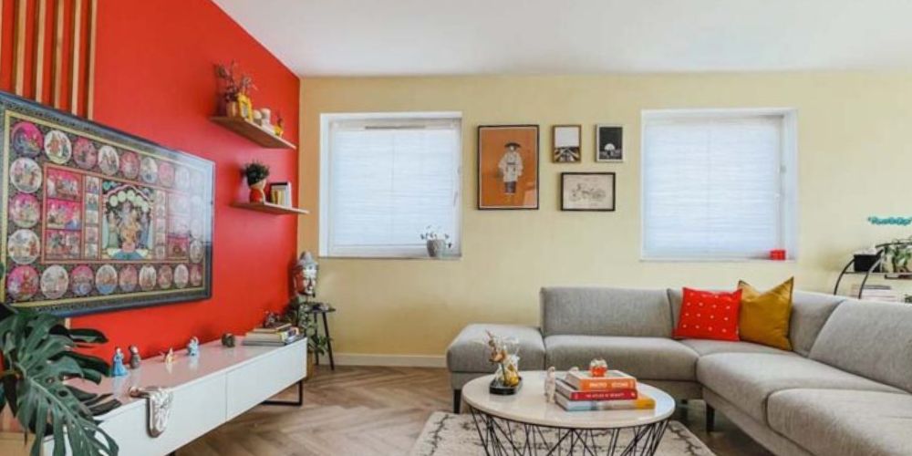
One of the most emotionally intense colors, red symbolizes passion and energy. It is one of the favored colors in accent walls and statement furniture. Red can also indicate danger or urgent warnings because it has always been used with warning signs. Avoid bright red paint in relaxation rooms, but consider it when you need to pump up energy, such as in your kitchen or gym.
Blue
Blue is universally considered the color of peace and reliability. Exposure to it produces calming effects, which is why it is a standard material in workplaces and bedrooms. Light shades of blue, especially the dark ones, give off a roomy ambiance with serenity.
Yellow
Yellow represents brightness, cheerfulness, optimism, and creativity. It lifts a room and can make it look larger than it is. However, too much yellow can easily overstimulate, so a balance needs to be maintained. Use yellows in accent pieces, like throw pillows or artwork, to create a cheerful, happy atmosphere without overwhelming it.
Green
Green is the color of nature, and for most people, it is associated with renovation and equilibrium. It can be used in any room, from living spaces to bathrooms. Variants of green are great for inducing relaxation while keeping the visual stimuli high. Green and neutral tones work together in a fresh, timeless way.
Orange
Orange balances the energy of red with the warmth of yellow, making it an energetic and inviting color. It’s appropriate for social areas like the living room and dining area. Orange encourages creativity and conversation but can be overpowering when used excessively. Softened tints, such as peach, will provide a more subtle effect.
Purple
Historically associated with royalty and wealth, the psychology of the purple color is sophisticated and speaks to creativity. Light purples, like lavender, are calming and appropriate for bedrooms, while deep purples bring drama and elegance into formal rooms. Purple is also an excellent color for reading nooks or meditation areas where one wants to be creative and introspective.
Pink
Pink is a soft, nurturing color that evokes love and warmth. Though generally associated with femininity, pink is used neutrally and versatilely in modern design trends. Pink adds subtle charm to any space, from blush-toned walls to rose-gold accents.
Black
Black is bold, timeless, and sleek. When used thoughtfully in interior design, black adds depth and drama. From a black feature wall to sleek black furniture, this color just oozes sophistication. Black is commonly combined with lighter tones to make striking color combinations that balance power with accessibility.
White
White is synonymous with simplicity and cleanliness. It opens up spaces and reflects light, making rooms feel larger and brighter. White is a neutral base that lets other colors shine. We recommend white for minimalist aesthetics at Alexia Home Designs, layering it with textured elements to add depth.
Color Combinations
Colors have individual effects, but mixing them in specific ways multiplies them. For example, a mixture of blue and green has a natural soothing effect, while a combination of red and yellow gives off warmth and energy. Understanding the psychology of colors and how colors interact is crucial for choosing the appropriate color palette for any space. Complementary colors, a monochromatic scheme, or triadic palettes serve different design purposes, depending on the mood one wants to create.
Choosing the Perfect Palette
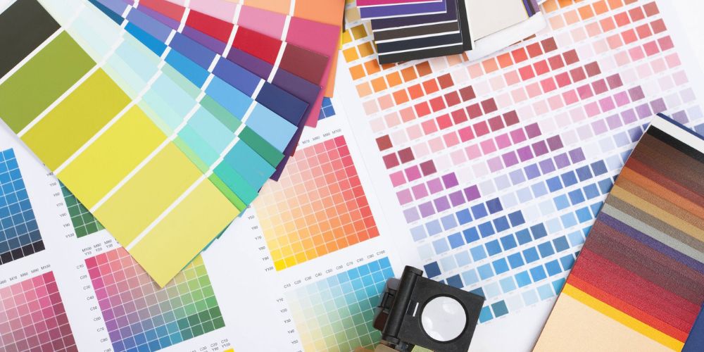
Choosing a color palette for a home or project involves considering the space’s intended purpose and/or the emotions to be projected. First, identify one dominant color, then add two or three accent colors, creating harmony with contrast. Neutral colors like beige or gray balance out bold colors without overwhelming a room.
A soothing living room could have soft blues and greens balanced by neutrals. On the other hand, a playroom could be in bright yellows, oranges, or playful patterns. Alexia Home Designs has the eye for creating just the perfect palette that reflects your taste while ensuring the mood in your rooms is optimized with functionality, too.
Practical Applications of Color Psychology
- Interior Design: Warm colors are cozy, and cool colors are calming. Use color intentionally to draw attention or establish a mood.
- Branding: Businesses use colors to evoke feelings of trust, excitement, or sophistication. Blue suggests reliability, while red is a stimulating color that grabs attention.
- Fashion: Colors can affect people’s feelings and instill confidence. Black is powerful, while lighter shades denote approachability.
Alexia Home Designs is all about harnessing color psychology into designing your spaces to inspire and be you.
Conclusion
Colors significantly influence our emotions and experiences. By understanding the psychology of colors, you can select hues and color combinations that create harmony, aligning with your lifestyle. Your color palette matters whether you desire a serene retreat or an energetic hub. At Alexia Home Designs, we specialize in crafting homes that resonate with your emotions and needs.